Decades of Divergence in Dino Depiction

Many of my paleontology projects are based on the question of what we think dinosaurs looked like, and why.  We only know about dinosaurs from their fossils, which mostly only show their bones, and are often missing many pieces and are badly deteriorated.  However, when we see pictures of dinosaurs in the media, we see them as fully-realized animals with skin and colors and so on.  How have we gotten to the point where we have come up with such images?

The short answer is that some illustrators work directly with scientists to help flesh out their images, and others do plenty of primary research.  But others just base their drawings on what they’ve seen, and those images quickly become more and more divorced from the science, just like a game of Telephone.  And of course, even the original visual conceptualizations are best guesses, based on those partial fossils.

Not only that, but the science changes over time, with new ideas evolving as new fossils are found!

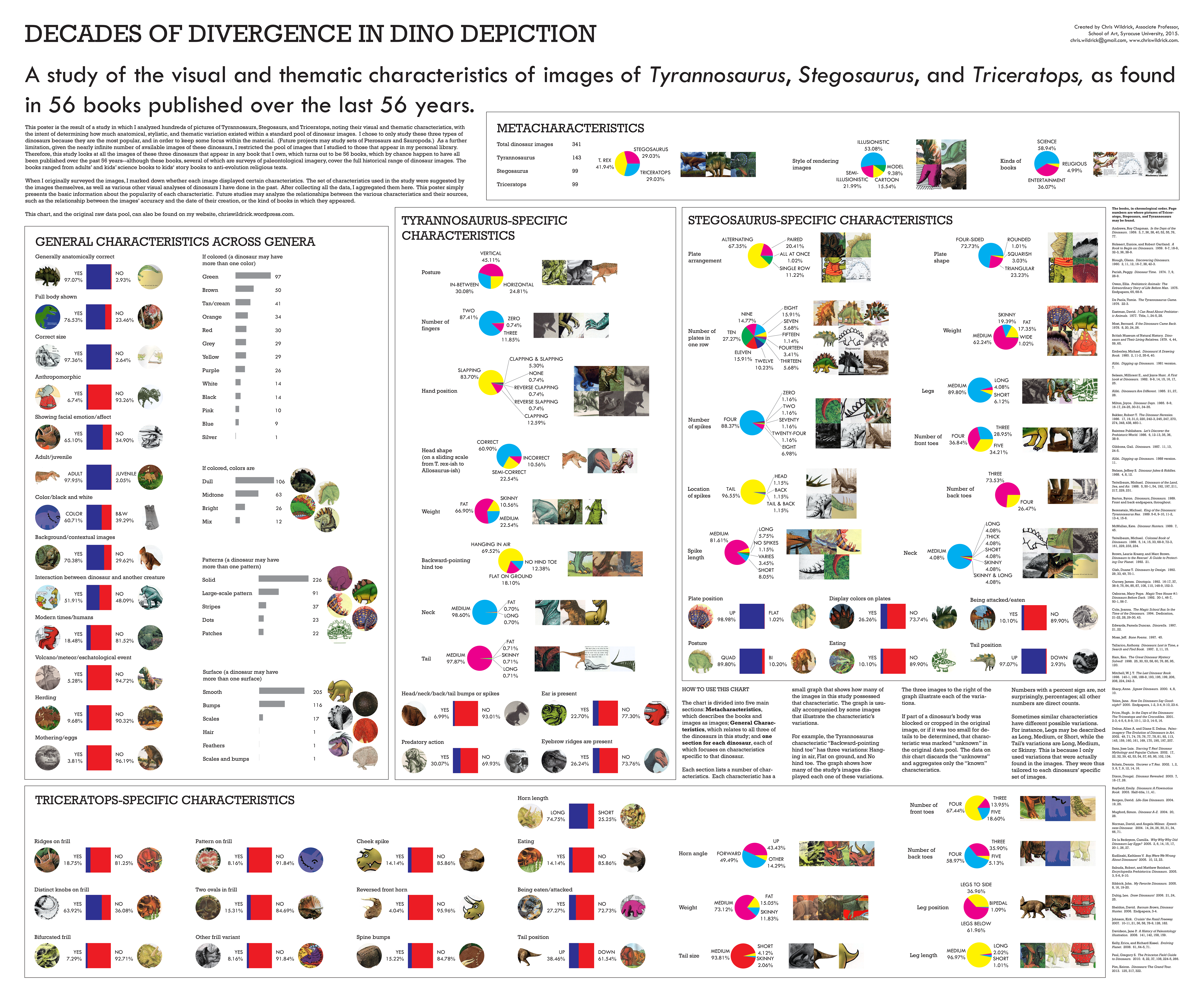
I have often surveyed everyday people about what they think dinosaurs looked like.  In this case, I went to the printed record, and did a morphological analysis of every image of just three dinosaurs–Tyrannosaurus, Triceratops, and Stegosaurus–that can be found among all my paleontology books.  This includes books aimed at all ages, and books that are both entertainment-oriented and scientifically-oriented.

Future versions will do the same for other popular dinosaurs.

This resulted in a huge data pool.  Here is the final analysis, which is in poster form.  It’s been reduced a bit in resolution to fit here but should be fine for these purposes.  Check it out!

decades-of-dinos3

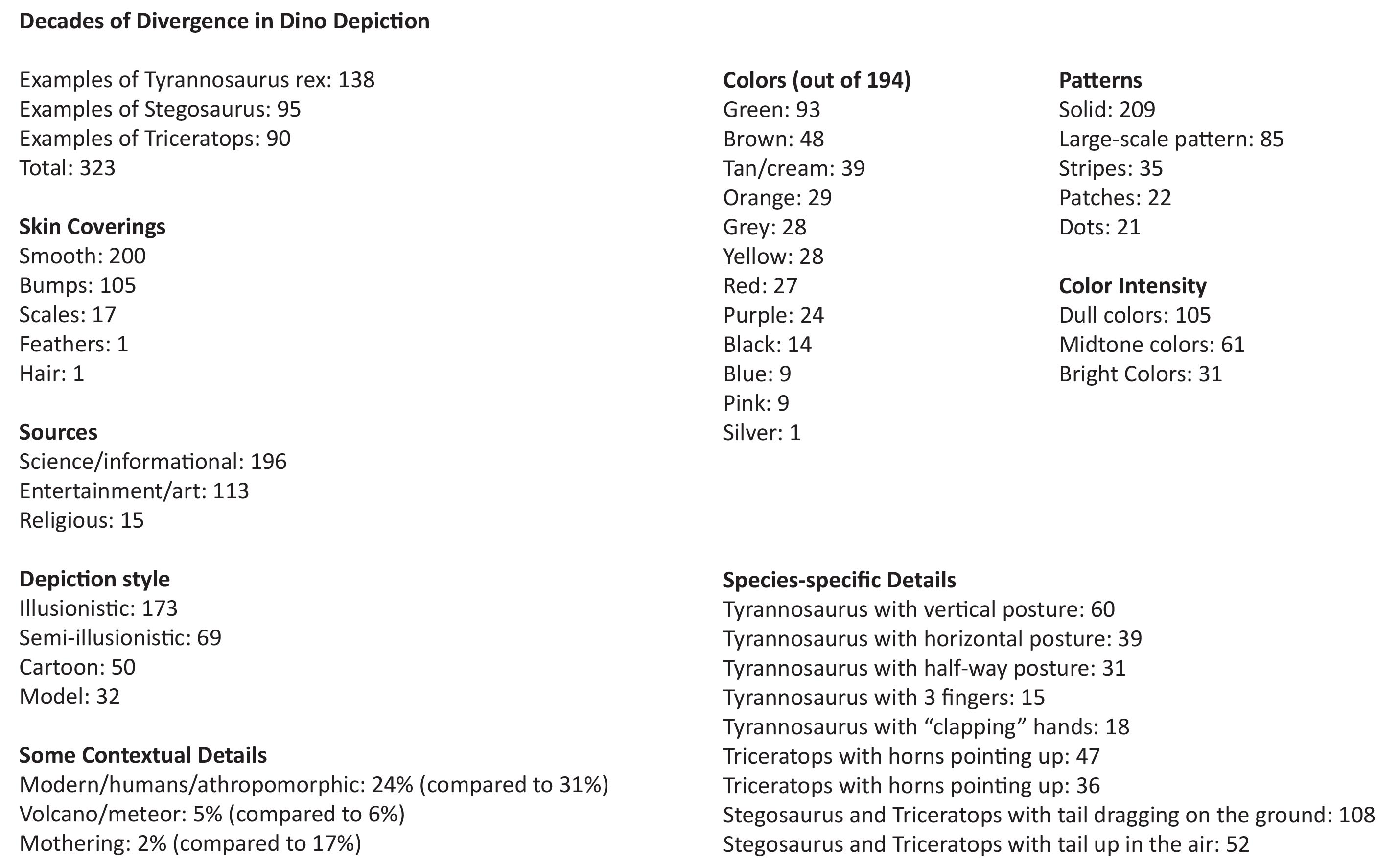
Some of the earlier information, while I was still in the process of analyzing it, can be seen below.

text

Here is the complete data pool, which allows you to see all the characteristics I listed for each image.  I looked both at their visual characteristics (for instance, their color, or the number of plates a Stegosaurus has) as well as their contextual details (for instance, were they shown fighting with another dinosaur, or were they presented in an extinction scenario).

I did an aesthetic-cladistic analysis of the dinosaur images, as I had done earlier for the Clay-dograms, with these sample results.  Each dinosaur (Tyrannosaurus, Triceratops, and Stegosaurus) has two charts, one breaking down the morphology of their images, and the other breaking down their contextual information.

The visual characteristics:

This slideshow requires JavaScript.

The contextual characteristics:

This slideshow requires JavaScript.

Dinosaur Name Pronunciations, I & II

I did two surveys of the pronunciations of dinosaur names.  I have found that people, including paleontologists, often pronounce dinosaur names quite differently, and wanted to find out whether there were any definitive right or wrong ways to say them, or at the very least what trends I would find.  I presented both surveys as posters at a paleontology symposium at the Museum of the Earth in Ithaca, NY.

The first poster surveyed children’s books, because children’s books are where most people first hear dinosaur names pronounced aloud, and are probably where even most adults get most of their pronunciations from.  It is called A Survey of the Variance in Dinosaur Name Pronunciations in Selected Children’s Books.  It looks at 17 books published over a wide time period, and collects 385 pronunciations of 173 dinosaur names.

The second poster surveyed internet sources.  There are several dictionary-style dinosaur websites, each with huge lists of pronunciations, so I thought it would be worthwhile to look at them both in terms of building a giant data set, and because internet sources are likely to become more and more popular as sources for people to check on pronunciations.  They are also probably more adult oriented, and possibly more scientific than the often (but not always) entertainment-oriented children’s books. It is called A Survey of the Variance in Dinosaur Name Pronunciations in Selected Internet Sources.  It analyzes 10 sites and nearly a thousand species, fora total of 2875 different pronunciations. Interestingly, I found two websites that seemed to plagiarize their pronunciations from other sites.

The two surveys came up with some similar results–that there is a lot of variation in pronunciation–but also some differences.  I recommend reading both posters!

Clay-dograms

I did a lengthy interactive project with many people, Skin & Bones II, where people covered plastic dinosaur skeletons in clay in an attempt to make the dinosaurs look like what the people thought the dinosaurs looked like in real life. Then I analyzed the skeletons’ morphology according to over 30 visual characteristics.

For Clay-dograms, I took all the data about the skeletons’ morphology and fed it into Mesquite, a program that paleontologists usually use to create cladograms (sets of evolutionary relationships) based on real fossils’ morphologies. I broke the data down by the species of the original plastic dinosaur, then used the program to find the visual relationships that existed among the clay models.

There is one cladogram per species. The names are shaded from dark to light, depending on how many steps a particular model is from its original “visual ancestor.”  It should be noted that these are not necessarily the only cladistic solutions to the data sets, but are one viable possibility.

This slideshow requires JavaScript.

I performed Skin & Bones II, the project the Clay-dograms are based on, on multiple occasions in Ithaca and Syracuse, NY, including a preschool, multiple elementary school classes from kindergarten to 4th grade, a high school class, and random adults at various sites including the New York State Fair.

Here are a few examples of the 300+ models that people made:

This slideshow requires JavaScript.

Data Field Flags

I have made a lot of highly complex charts over the years, especially for my paleontology projects.  These are usually intended to break down complicated or unusual data sets to reveal interesting insights, using the charts’ visual design to highlight the information’s patterns.  Normally they’re hung in places where people can take the time to read them up close and digest all the information.  However, they also just look cool from a distance, even if that means seeing them just as visual compositions and ignoring the data.

I made four double-sided flags for Lillstreet Art Center in Chicago, where they were displayed on the roof for several weeks as par of an installation series.

The flags’ patterns came from a variety of previous charts, but were mostly dinosaur projects.  I enjoyed how they worked as bright, sigil-like designs from the street level, intentionally subverting their normal obsessive content for pure visual pleasure.  They frayed quite a bit in the Windy’s City’s winds!

Photo credit: Lillstreet Art Center