Concept and History:
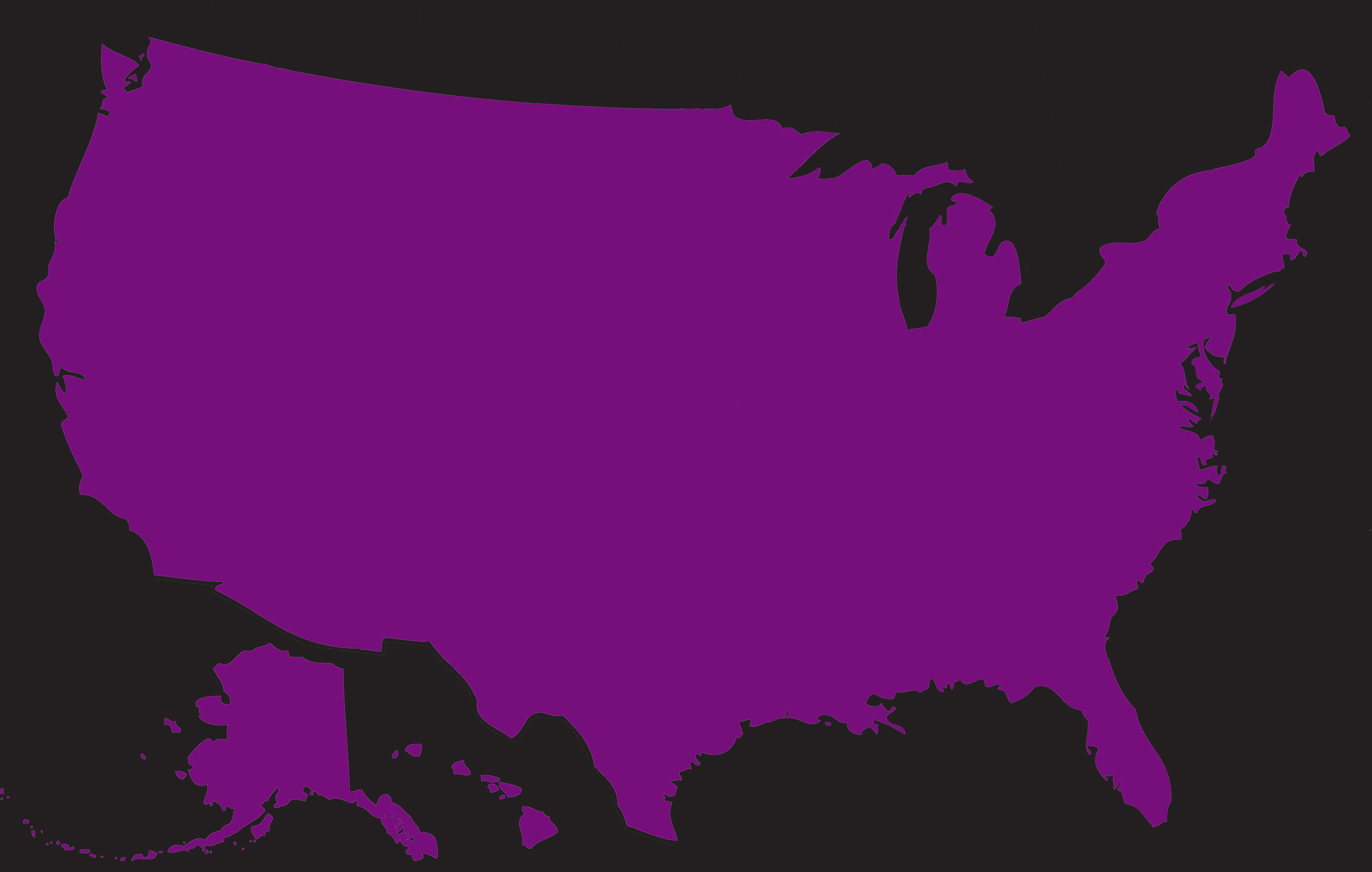
In 2008, inspired by Obama’s words that there are no red states and no blue states, and also to make a contrast with the way they are commonly presented on the news and social media, I created a map called Purple, showing that all states are purple states.
I colored each state a shade of purple based on results of the popular vote in that state. Purple, of course, is made by mixing red and blue. I took the percent of people in any given state that voted for the Democratic party, and made that the percentage of blue that was in the purple; and I took the percentage of people that voted for the Republican party, and made that the percentage of red that was in the purple.
For example, if a state voted 60% for Obama and 40% for McCain, I colored that state with a purple consisting of 60% blue and 40% red.
It turned out pretty much just as I hoped–a map that was clearly all purple, with some states more of a bluish-purple and some states more of a reddish-purple.
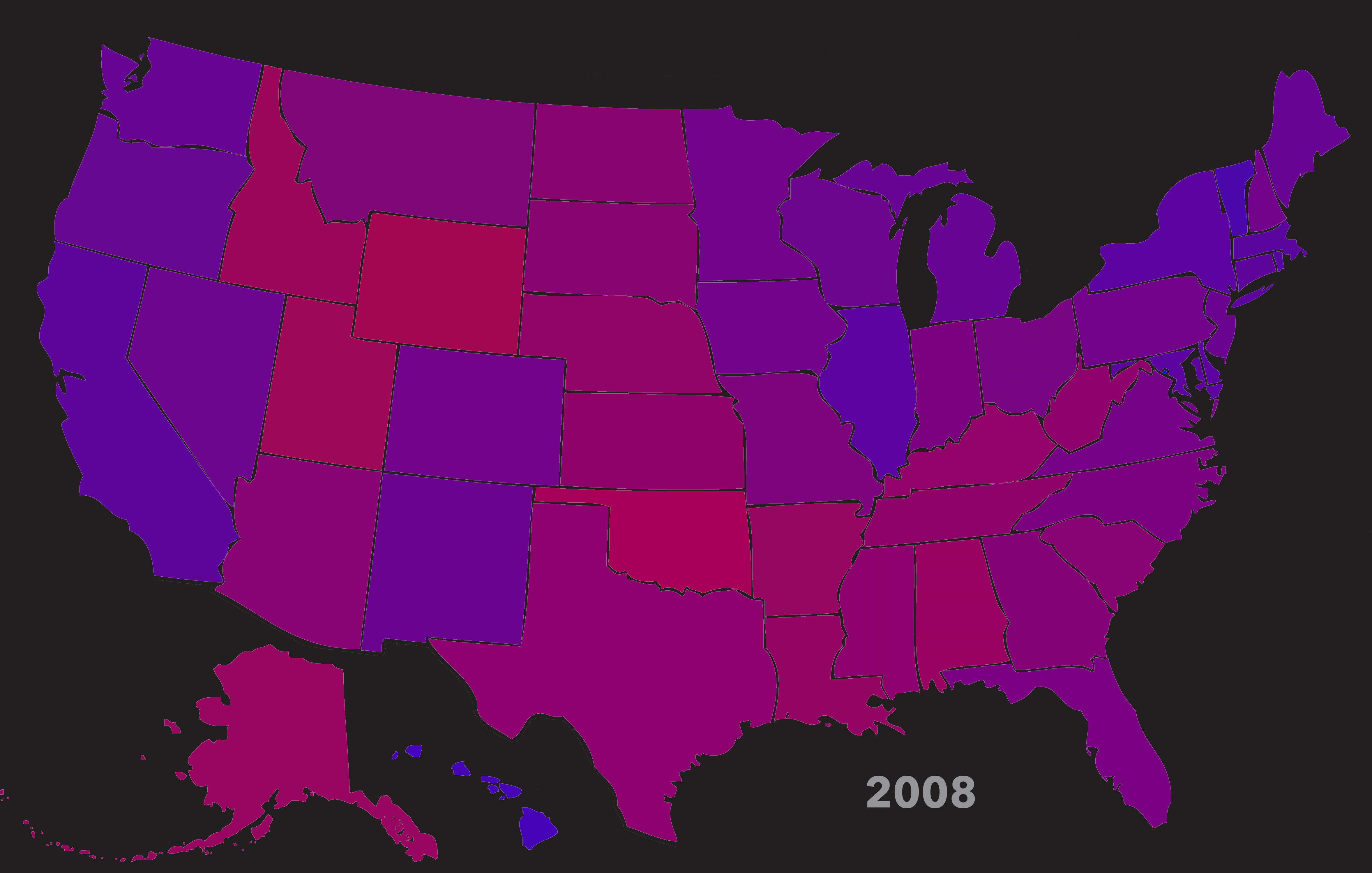
I made another map after the 2012 election. I altered my approach slightly, adding a third color for all the “independent” votes in each state, to make it an even better reflection of the range of voter ideologies. Since I created the original map using the red and blue color sliders in the RGB color tool in Photoshop, I now used the green color slider to represent all independent votes. It should be noted that the green color does NOT stand for the Green political party in particular. The color green stands for ALL “third party” votes, whether they are for the Green party, the Libertarian party, or anyone else. I could have broken down the independent vote by party, of course, but that would have required too many colors, and the colors wouldn’t have been at all discernable due to their low percentage of the vote. Even putting them all together, it is very hard to pick out their effect on the overall color mix (except for Utah in 2016, as you’ll see).
After 2016’s election, I was so depressed I didn’t make the map for a long time. A long, long, long time: June of 2020, only a few months before the next election.
I made a draft 2020 map soon after the election, but had to wait until February 2021 to do a final version because of how long it took to officially resolve all the vote counting and certification.
I made the 2024 map with a little faster bounceback than in 2016–soon after the 2025 election.
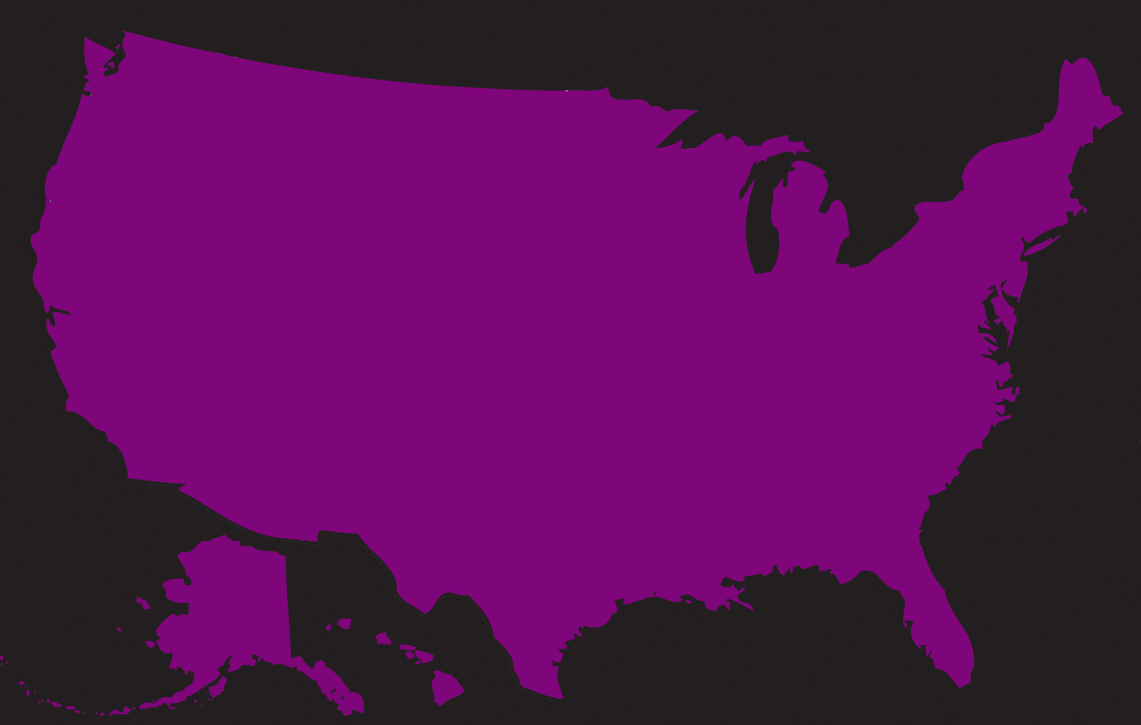
While making the 2016 map, I found that Wikipedia had a more complete count of the votes for all three elections than the sources I originally used in 2008 and 2012. I remade the earlier maps with this data, and all the maps now use red for Republicans, blue for Democrats, and green for all other votes.
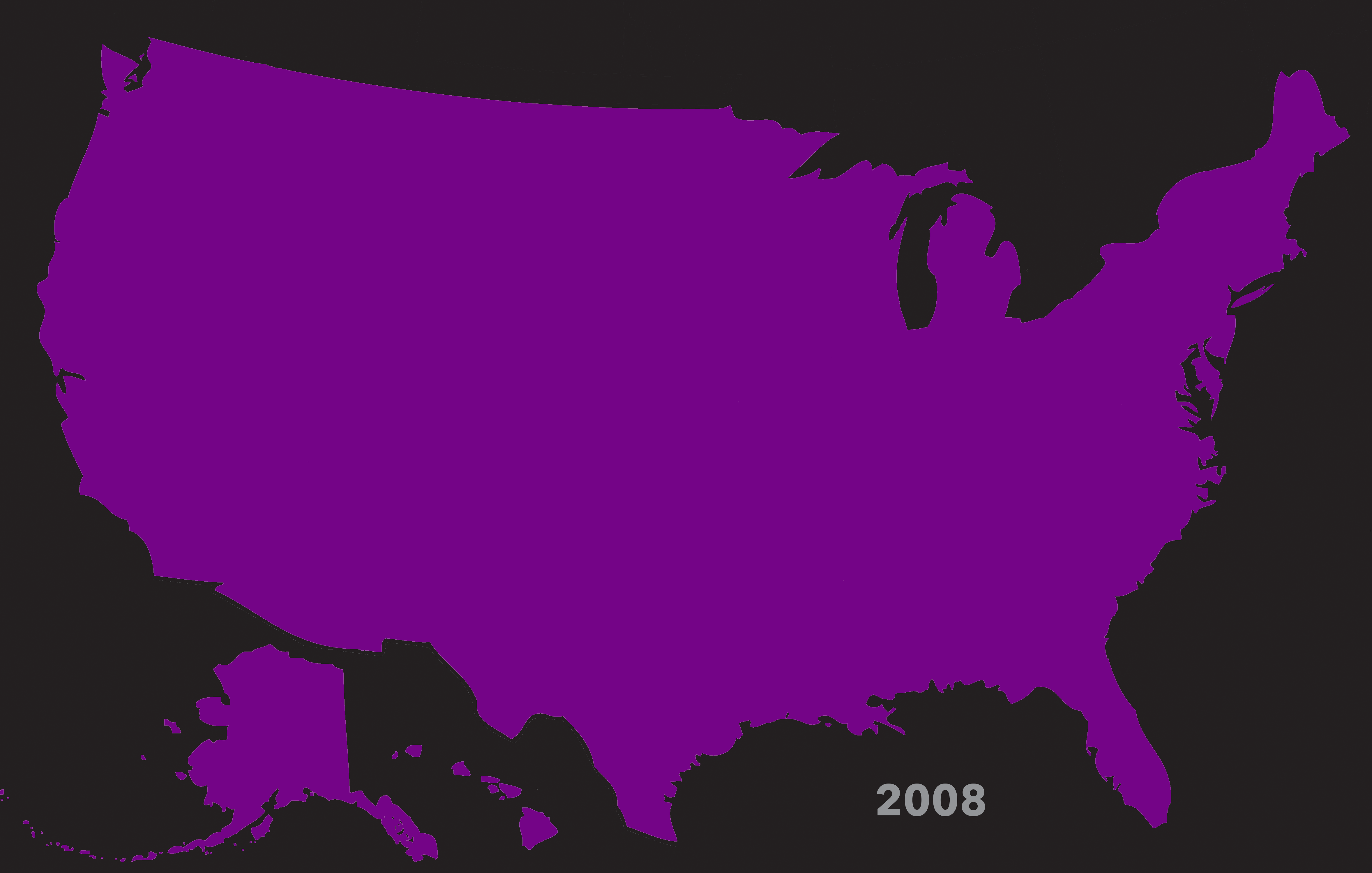
I also created a series of whole-country maps, creating a shade of purple for the entire US popular vote for each election.
The maps you see on this page are all the updated maps.
State-by-State Maps
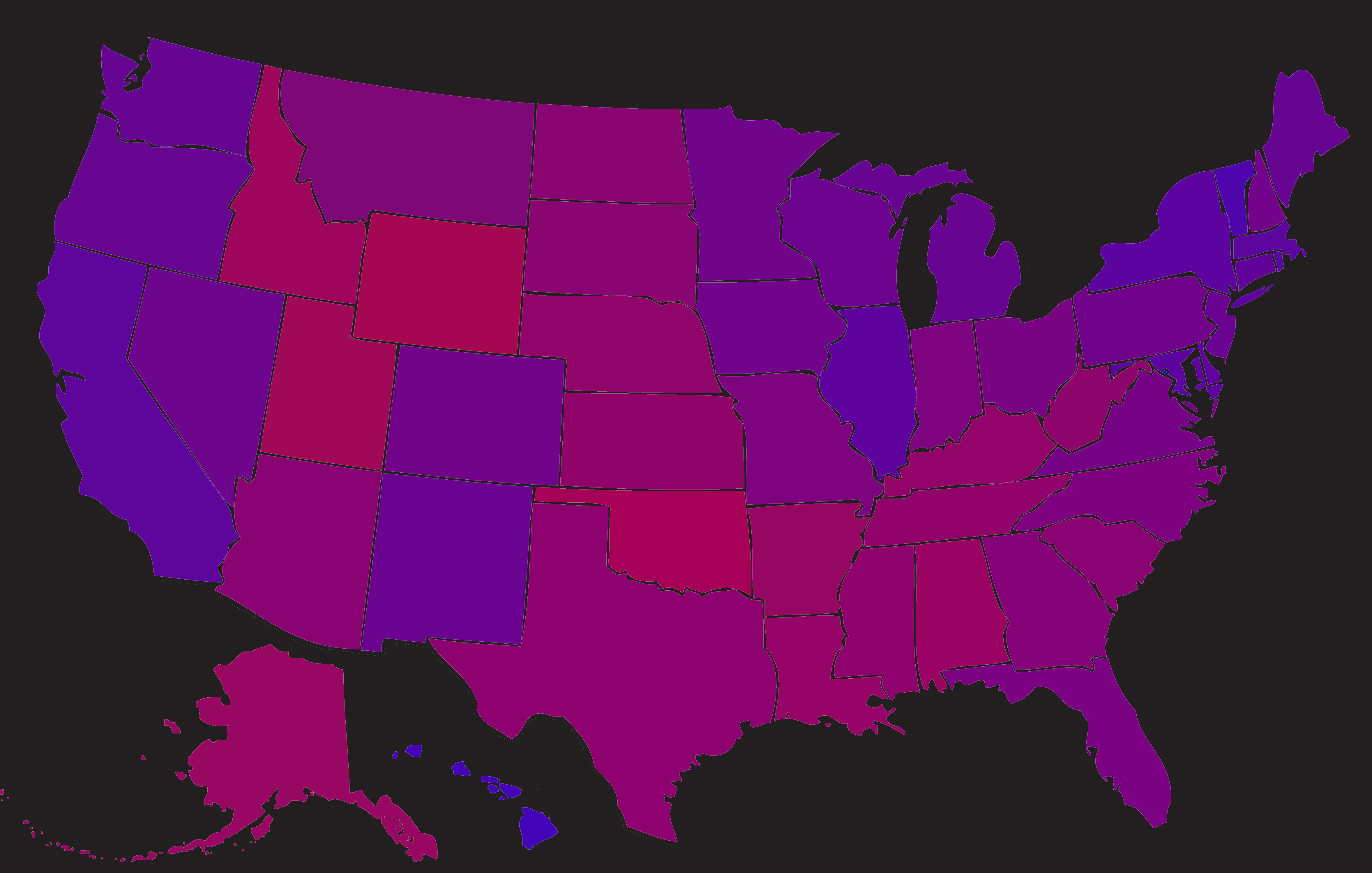


***Why is Utah brown? 27% of Utah voters voted for independent candidates this election, adding in a huge proportion of green, visibly affecting the state’s color.***
Purple IV: 2020 Election
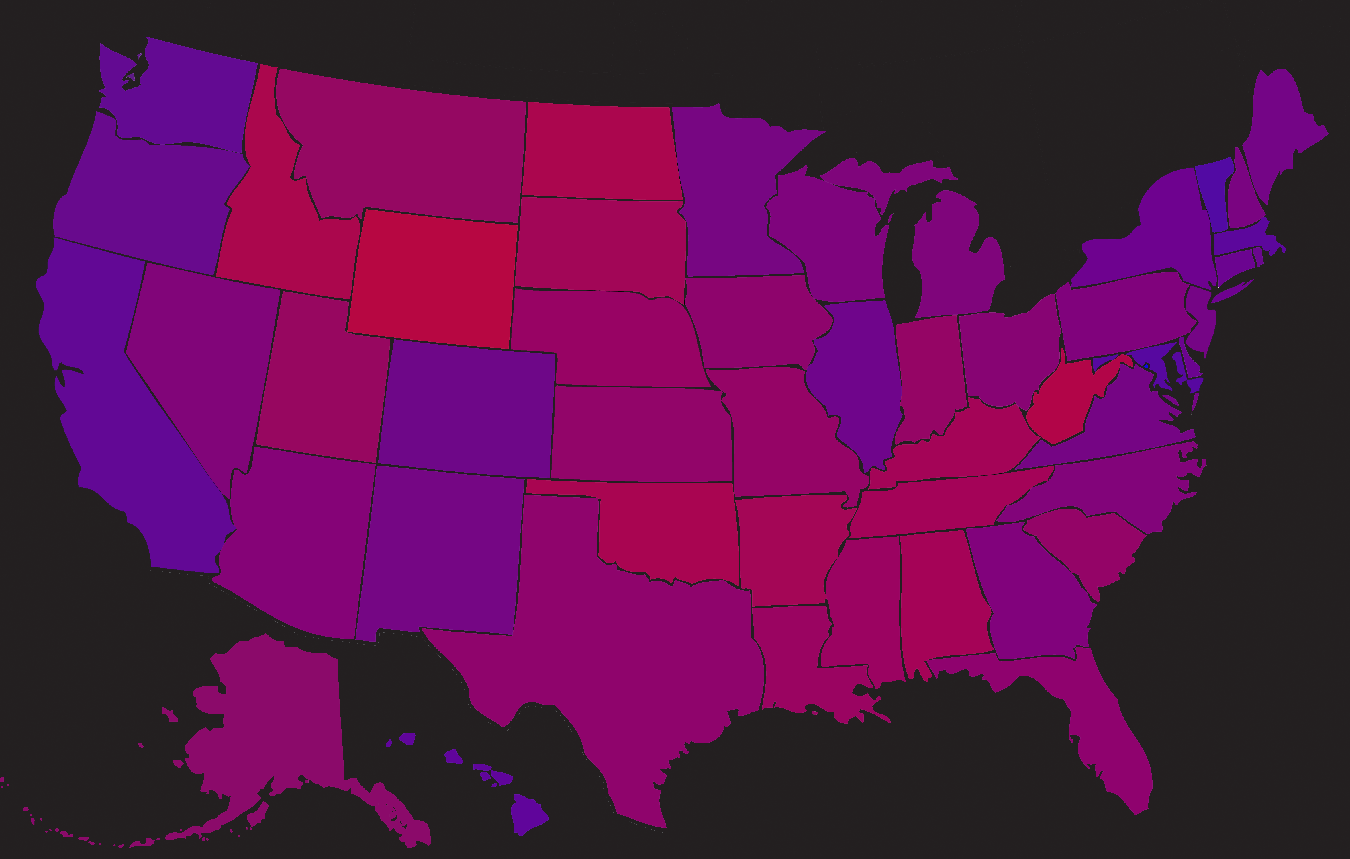
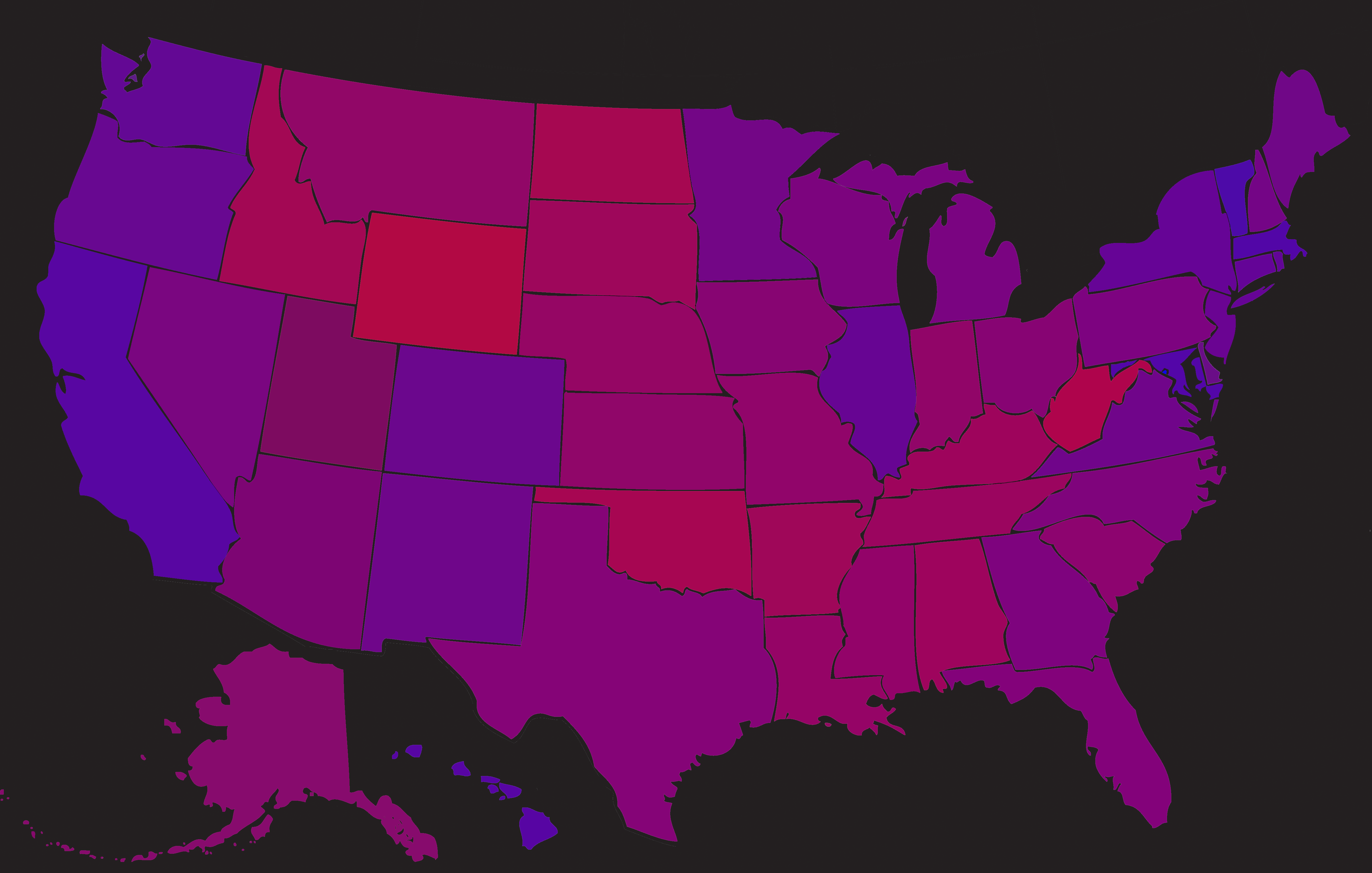
Purple V: 2024 Election
Whole-Country Maps


Purple IVB: Whole-Country Map, 2020
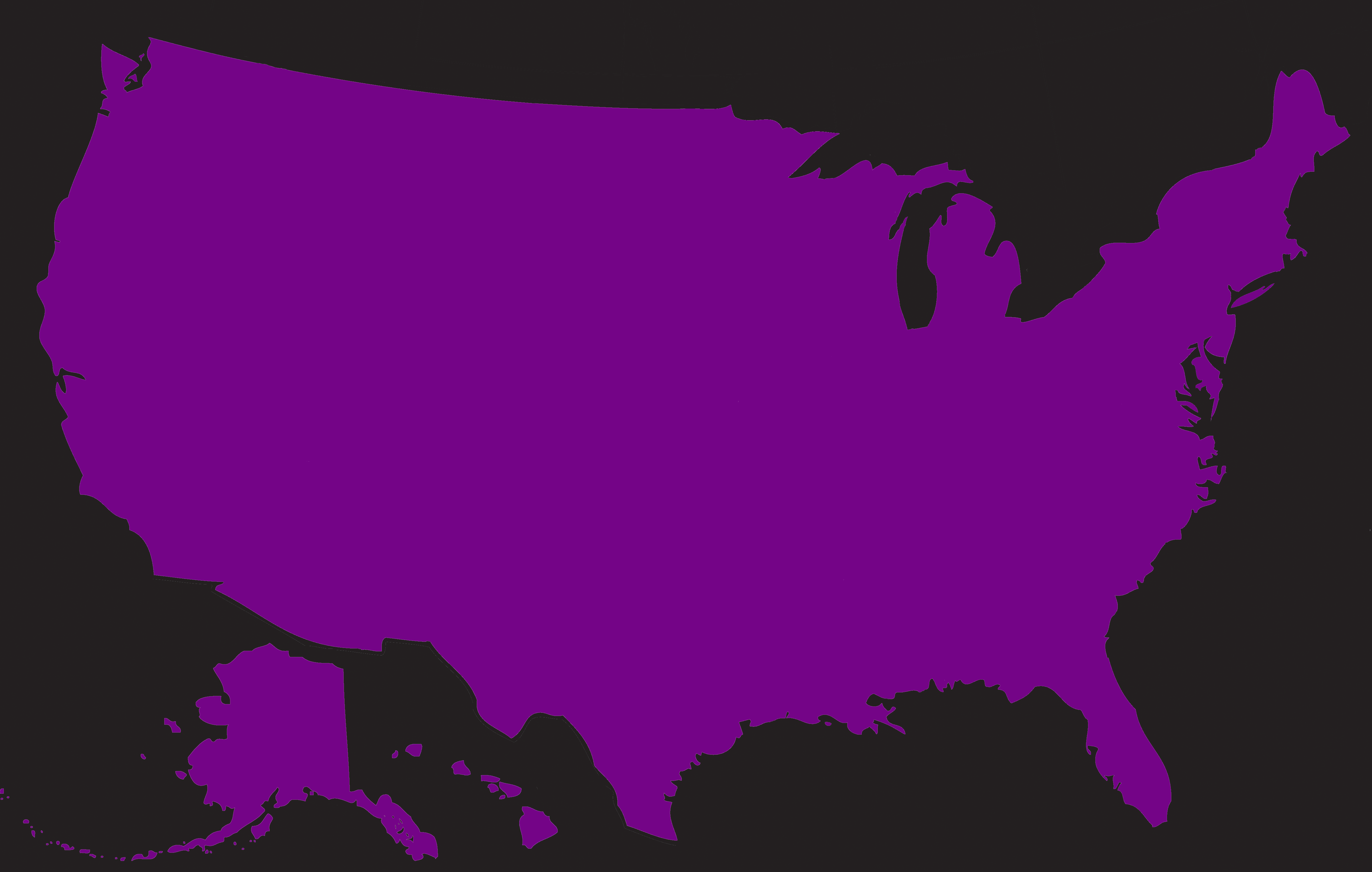
Purple VB: Whole-Country Map, 2024
Animations!
These are GIFs, so they’re limited to 256 colors and creates some additional color artefacts that are less than perfect. They loop the 2008, 2012, 2016, and 2024 images. If you want to, you can download the main image files above and cycle through them on your own computer for a higher-resolution experience. But, enjoy these as they are.
Purple: Individual States Animation, 2008-2024
Purple: Whole-Country Animation, 2008-2024
Technical Process:
Here’s how it worked, using New Hampshire in 2012 as a random example. The vote in New Hampshire was 46.4% Republican, 51.98% Democratic, and 1.63% independent.
I created the purple of each state using the RGB, or Red-Blue-Green, color sliders in Photoshop. (That’s why the Independent party voters are green.) Every color in an RGB color space is created by mixing Red, Green, and Blue in a particular ratio. Each of these three component colors is numbered from 1 to 255, with 1 signifying a total lack of that color, and 255 signifying full saturation of that color. The final color is a ratio of the numbers of the individual red, blue, and green colors that it is comprised of.
To get New Hampshire’s color, I multiplied the voter percentages by 255, which gave me a percentage of the full saturation of each color. 46.4% of 255 is 118 (all numbers in the RGB sliders must be whole numbers), 51.98% of 255 is 133, and 1.63% of 255 is 4. Therefore, New Hampshire’s color is made by mixing red at 118, blue at 133, and green at 4, with the result being a particular shade of purple.
Statistics:
These slides show some of the basic top-level stats for each election, such as the average amount of each color per election, the average gap between the colors, etc.
Click to see them full-screen.
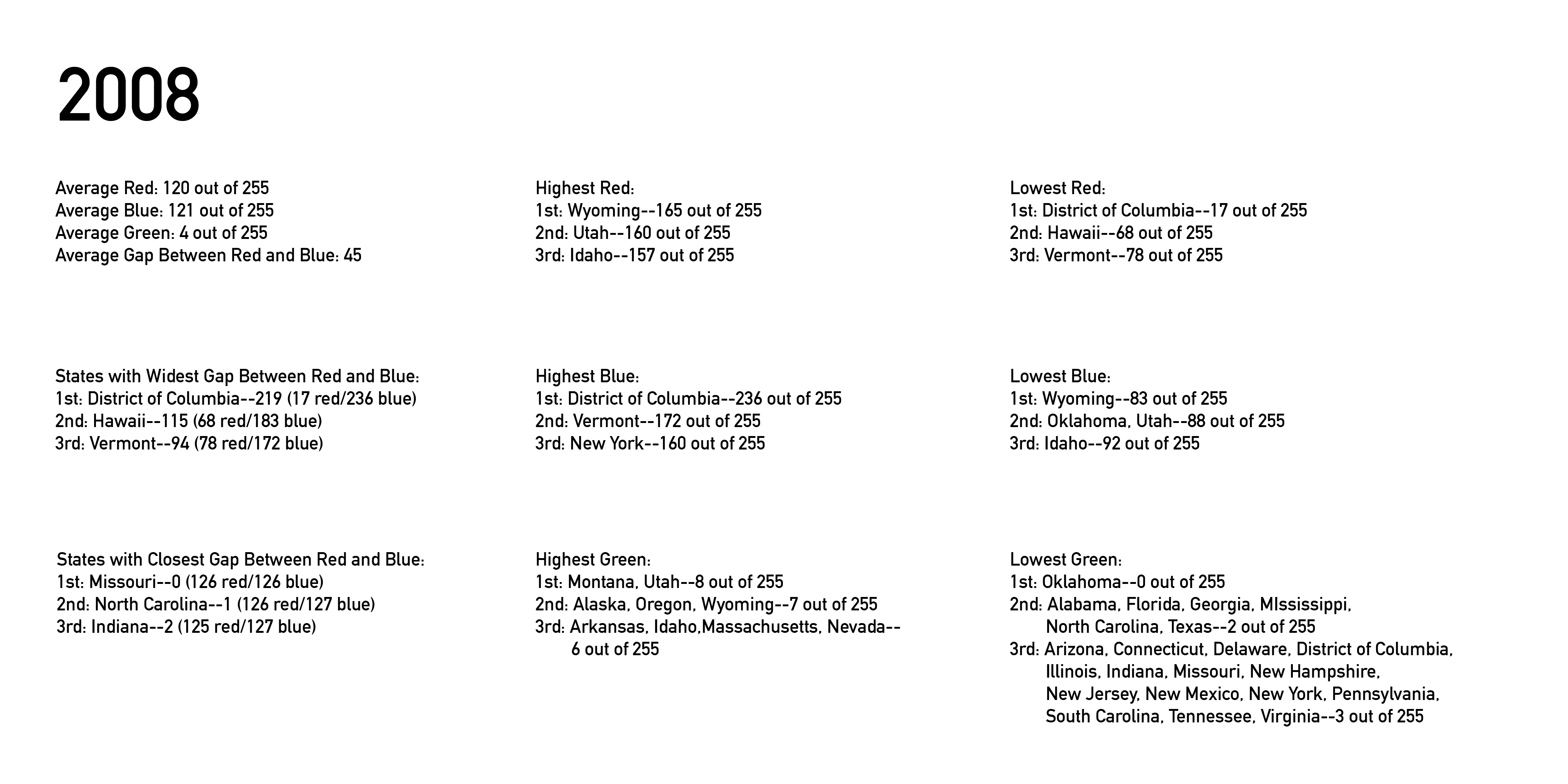
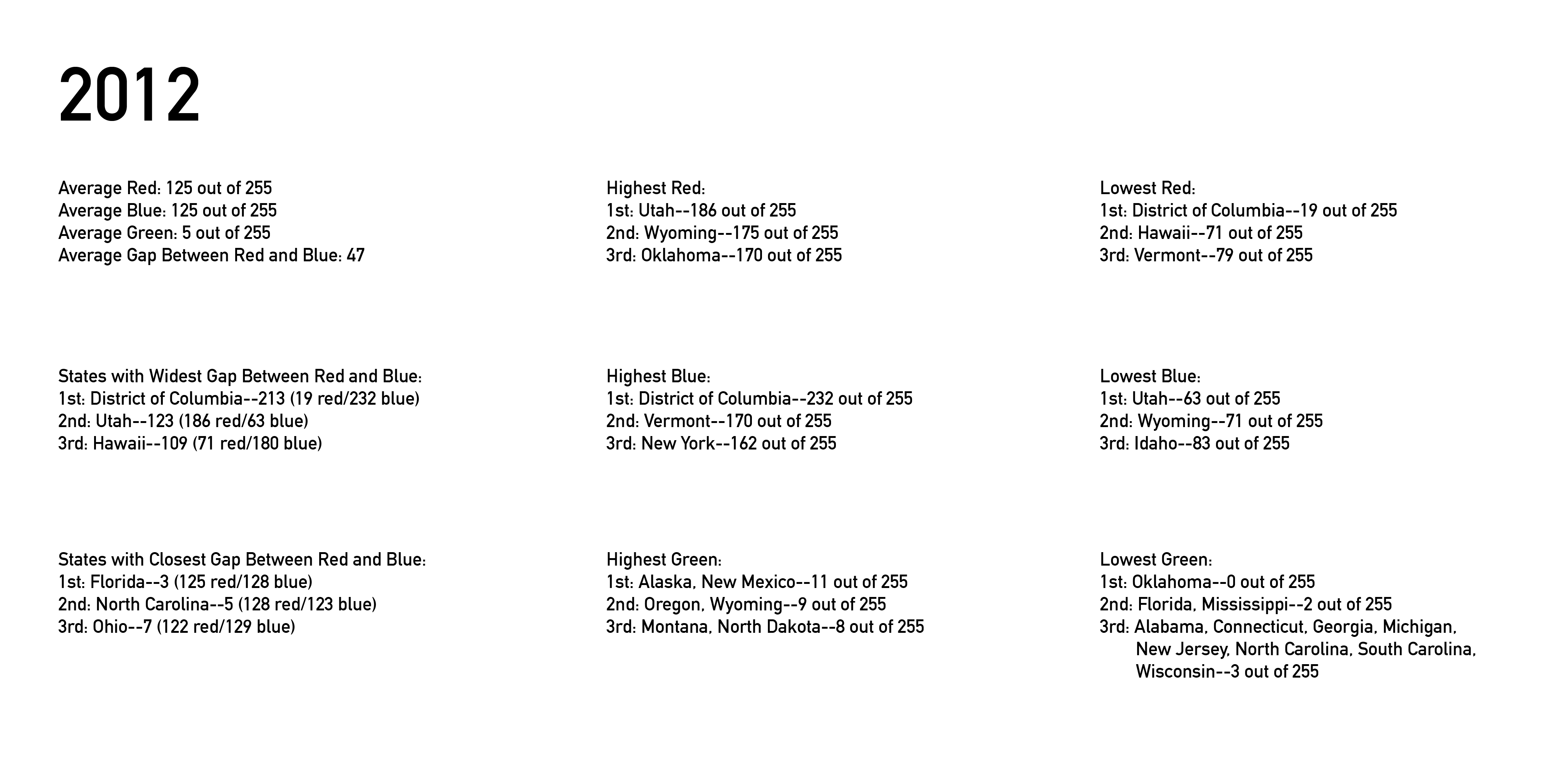
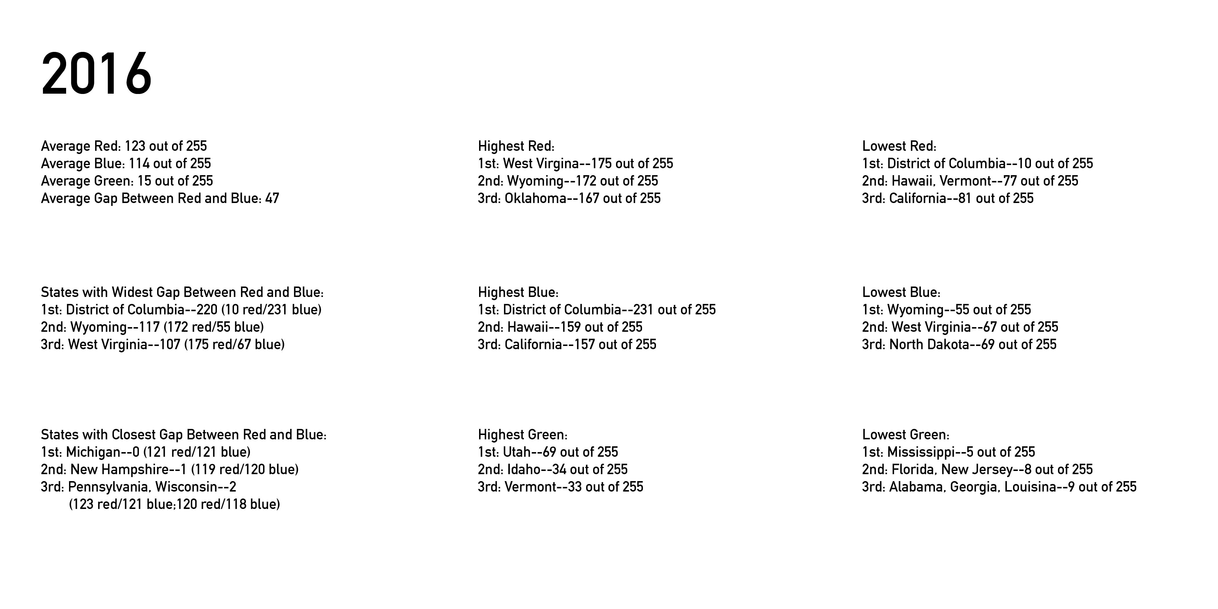

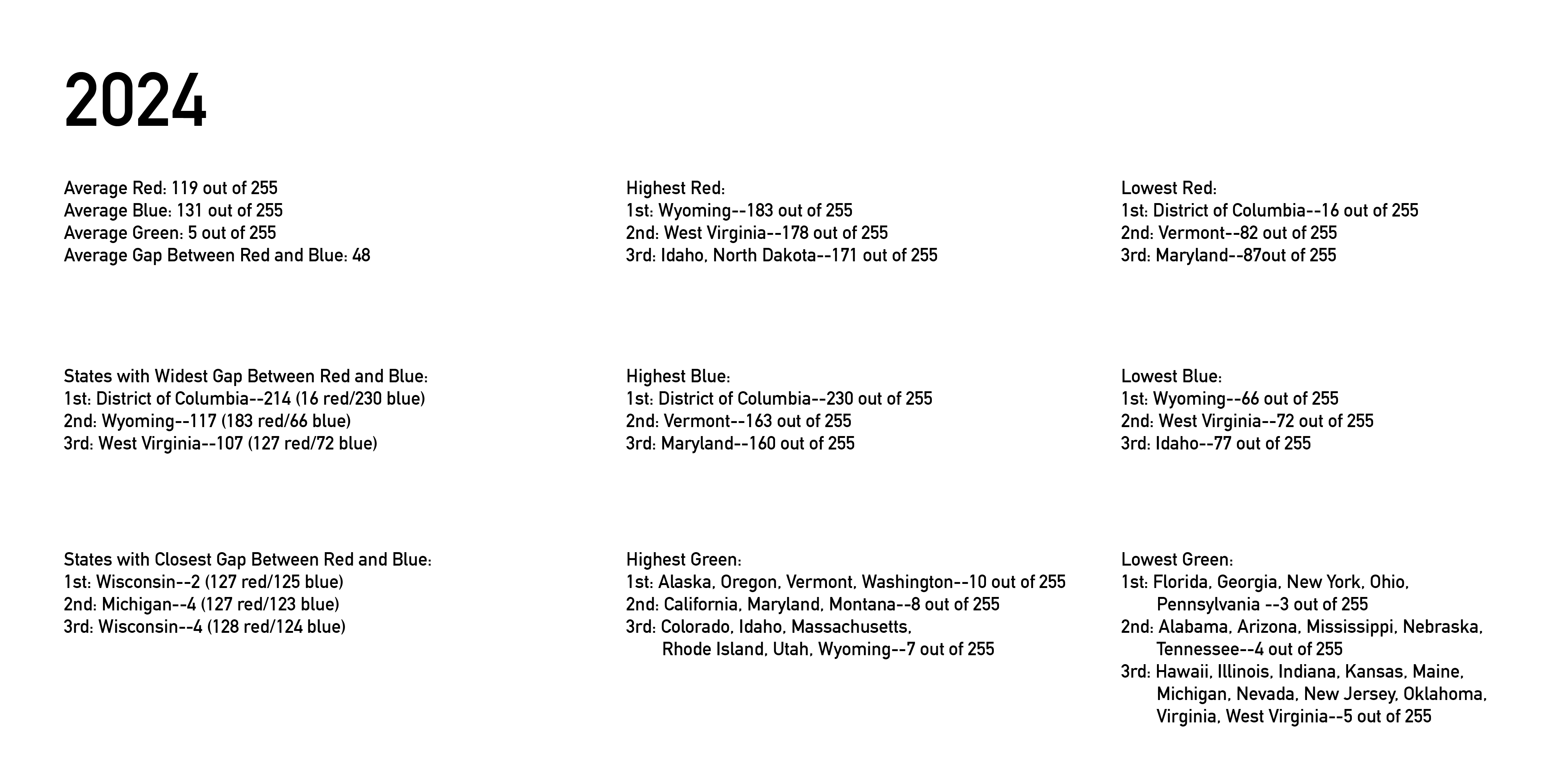
The full data set for each election, including each state’s popular vote and the formulas I used to convert them into RGB color space, can be found here: 2008, 2012, 2016, 2020, 2024. Again, I used Wikipedia as a source for these numbers: 2008 entry, 2012 entry, 2016 entry, 2020 entry. I used the American Presidency Project for 2024 because it lumped all the third parties into one group which is all I need for this project.
You will find certain trends, but also some interesting changes, from year to year. For instance, the increase in voting for independent parties increased drastically in 2016 (from 1.41% in 2008 and 1.73% in 2012 to 5.73% in 2016. This was partly due to an anti-Trump candidate who got a lot of “home” votes in Utah and Idaho, but it wasn’t just that: seven states had over 10% of their vote go to independent candidates. The states with the closest votes–the closest “battlegrounds”–has changed each election, so even though we think there are a certain set of red, blue, and battleground states that are locked in forever, that is not quite the case. The states with the highest amount of red and blue have been fairly but not completely consistent.
Reflection:
In 2008, I was in an optimistic mood about our political future, and wanted to show the fundamentally mixed and moderate (as opposed to divided and extreme) nature of Americans’ ideologies. By 2012, there was a lot less political civility and cooperation than I had expected in 2008, but the 2012 election showed that there were still a fair amount of purple feelings out there in the country. In 2016, due to Trump’s toxic influence, the election process and results were a dumpster fire of anti-civility and anti-moderation. However, even though you can clearly see an uptick in red within the purple, the 2016 full-country map is still has more blue than red in its version of purple, since the popular vote went for the Democrats. (2008 still has the highest percentage of blue for the overall country.)
It is incredible to me that the colors of the whole-country maps are so similar from year to year, and yet they represent one of the biggest swings in American presidential ideology and behavior in history. And yet, given all the divide, we continue to be purple. 2020 was blue-purple again, and then 2024 tipped over the line towards red for the first time in this set of charts–but it is still a version of purple.
What does it mean to be purple, though? As I said, I was originally inspired by Obama’s speech where he said there were no red states and blue states, only the United States. I took his meaning to be that most of us were ourselves purple: a mix of different ideologies, but largely moderate and considerate of each other’s ideas. So, not only were the states purple, but each individual person was purple.
This was a nice idea, and it is still my ideal, but the years after 2008 have become more and more partisan, not only for the parties, but for individual people as well. There is now clearly a pretty high percentage of people who think of themselves very specifically as red or blue voters. You could have a state where you have 50% super-blue voters and 50% super-red voters, and it would still average out to a perfect purple, which would not accurately reflect the gulf between those voters. On the other hand, the percentage of registered Independent voters has also increased since 2008. The high level of independent votes in 2016 in particular may have been a reaction to those specific candidates, but perhaps it shows that there is still some purple out there. (The percentage of green in the map has been quite consistent other than 2016, regardless of the number of registered independents.)
It’s fair to say that my opinions on whether moderation is an objective good have also changed over the years. When one party embraces racism and conspiracy theories, and eschews the entire concepts of truth and evidence, then that changes what it means to be in the “center.” But I do believe in doing the hard work to find pragmatic solutions among contrasting approaches; listening to others; keeping an open mind; and keeping one’s loyalty to the people, not parties. Perhaps that’s what Purple means to me now.
